An Overview
Renovation Exchange is an enterprise B2B2C platform that modernizes the home renovation loan process, connecting lending organizations, contractors, consultants, and borrowers in one place. As the sole Product Designer from March–November 2022, I led the end-to-end design of their first dynamic web app — from research and information architecture through high-fidelity prototyping and QA.
Visit renovationexchange.com →
The Problem
A Platform Built for One, Expected to Serve Many
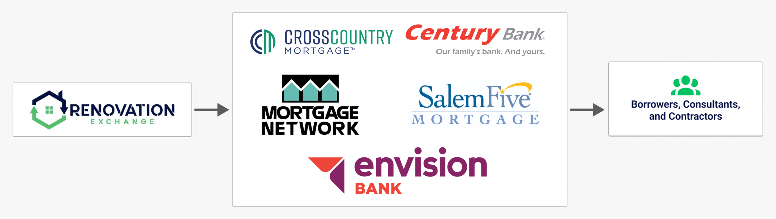
The original Renovation Exchange app was built exclusively for consultants: leaving lenders, borrowers, and contractors without a purpose-built experience. As the business scaled and added lending partners like CrossCountry Mortgage, Century Bank, and Mortgage Network, the gap between what the platform offered and what users actually needed became impossible to ignore.
The existing interface had four core issues: inefficient use of the properties table, confusing navigation with no clear functionality indicators, unbalanced layouts with poor element hierarchy, and inconsistent handling of empty or null data states. For a platform where multiple parties needed to coordinate on time-sensitive loan and renovation milestones, these friction points weren't just frustrating: they were blocking deals from closing.
The design challenge was twofold: fix what was broken for existing users, and build net-new experiences for personas the platform had never properly served.
The Solution
Designing for Every Seat at the Table
The work started with research before a single screen was redesigned. I conducted discovery interviews across all four user personas: 9 borrowers, 23 lender employees across CrossCountry Mortgage and Mortgage Network, 12 contractors, and 6 in-house consultants at A&M Appraisal Associates. From those insights I scoped the MVP around HUD compliance requirements and the highest-demand workflows for borrowers and lenders, using a demand vs. difficulty matrix to align stakeholders and engineering on feature prioritization.
.png)
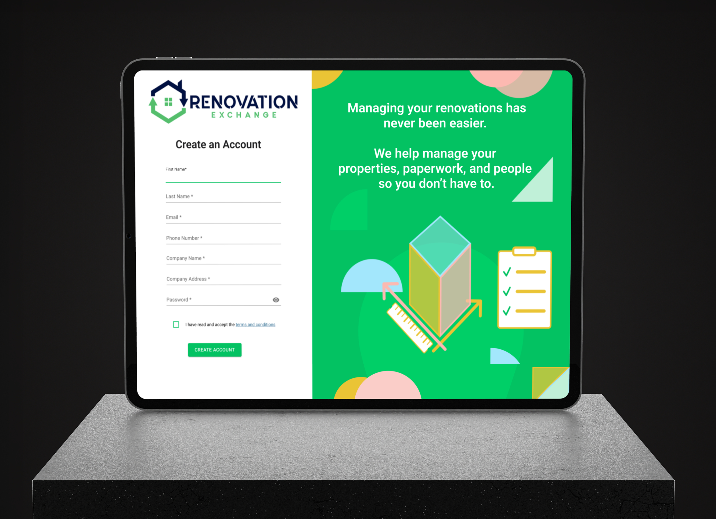
Design System & Branding
Built a custom design system and branding style guide from the ground up, using MUI as the foundation and extending it into a fully customized component library tailored to the platform's needs.
Deliverables
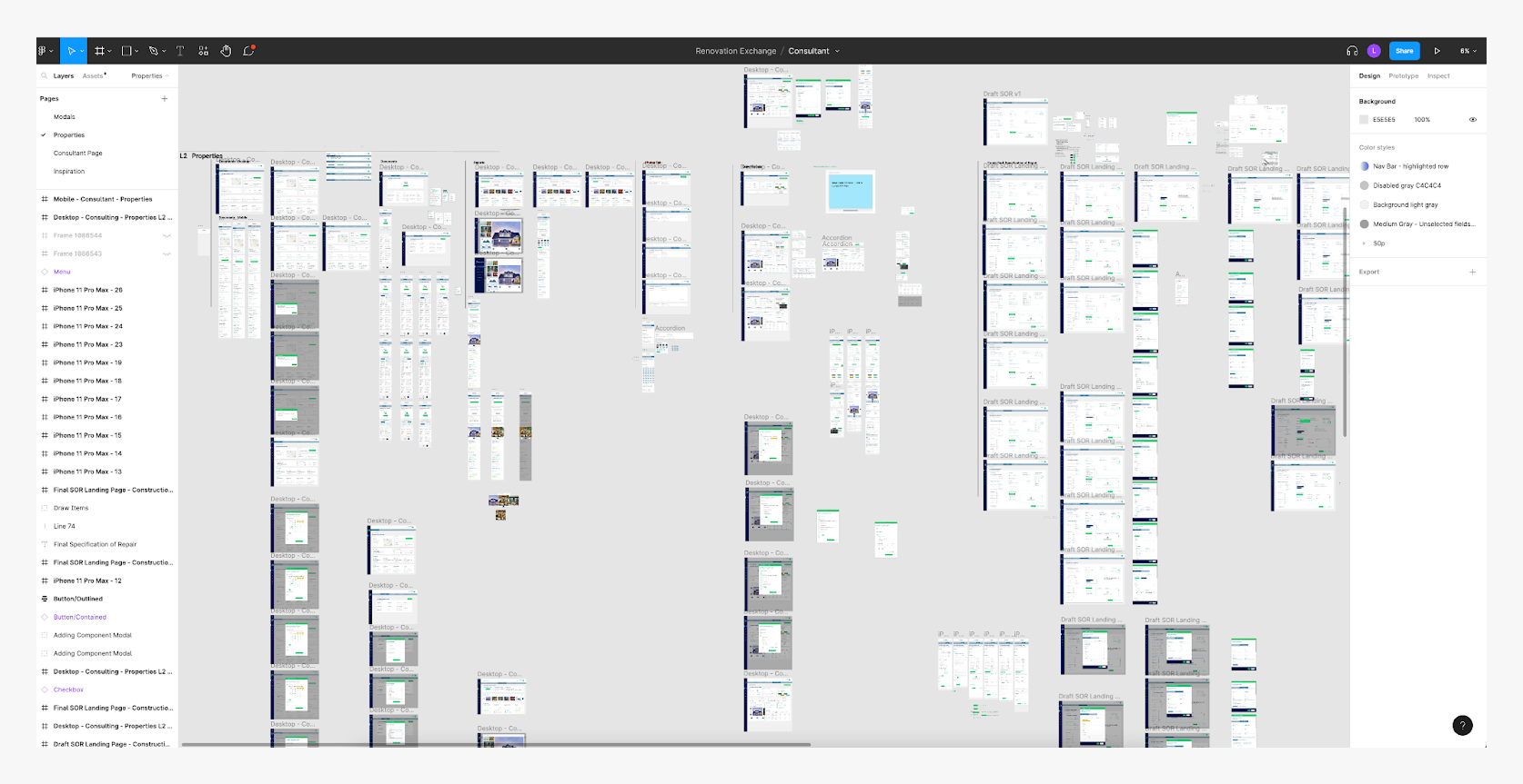
Led the end-to-end design process across every medium, from hand sketches and wireframes through high-fidelity mocks, interactive prototypes, user flows, and a notification system, all delivered across desktop and mobile.
Persona-Specific Interfaces
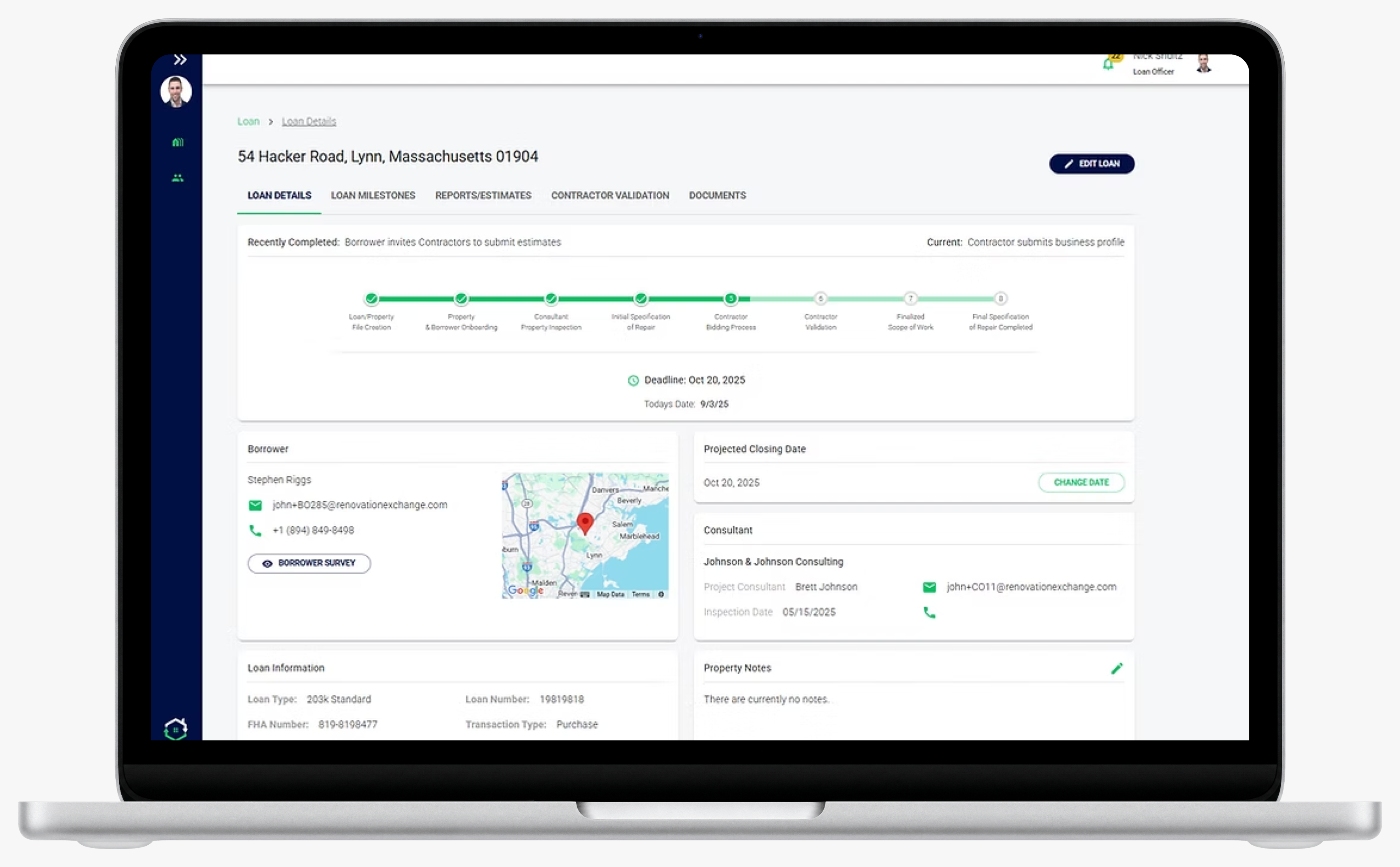
Designed unique dashboards and interfaces for five distinct user types: Borrowers, Lenders, Consultants, General Contractors, and Subcontractors, each tailored to their specific workflow and responsibilities within the platform.
QA & Collaboration
Worked day-to-day alongside the lead developer and dev contractor to ensure production builds matched Figma specs, regularly testing flows with an on-hand A&M expert to validate how different user types interacted with the platform.
Roadmap & Future Vision
Prior experience working on an ML platform informed early roadmap conversations at RenEx, where we kept an eye toward future automation opportunities as AI tools became more publicly accessible. Beyond that, I contributed to the product roadmap by designing and outlining a future contractor bidding platform, giving stakeholders a clear vision for the next phase of the product beyond the MVP.
Solo Designer
As the only designer on the team, I owned the full design process and maintained a continuous handoff cadence with both the development lead and business lead throughout the project.
The Results
A Clearer Path for Every User
Usability testing confirmed the redesign was working. User satisfaction increased by 50% as existing users found the platform significantly more intuitive and efficient, moving through workflows and finalizing projects faster than before. New users onboarding for the first time were able to navigate independently without guidance. The platform successfully scaled from a single-persona tool to a fully multi-sided experience serving borrowers, lenders, consultants, and contractors under one roof.
.png)
Takeaways
What This Project Taught Me
Designing for a multi-sided platform requires deep persona research before touching a single screen. Starting with the most active user group gave us a foundation to understand what every other persona needed. Establishing a solid design system early was not just a visual decision, it was what made scalable MVP delivery possible. The biggest win was not any single screen, it was building a shared design language that aligned stakeholders, supported the engineering team, and gave the product room to grow.